Exhibitions
2024
“Arboretum at SCAD” - Savannah, Georgia, USA “Arboretum – Ebb & Flow” - Nature Morte, Mumbai2023
“Prussian Blue – Aftermath” - KNMA, Noida “Arboretum” - Nature Morte, Dhanmill, New Delhi2022
“Kochi-Muziris Biennale” - Kochi, Kerala “Pop South Asia” - Sharjah, United Arab Emirates “The Game Play – Weeping Farm + NetZero 2030” - New Delhi “Bread Winner @ 5th Biennial Contemporary Art” - Mardin, Turkey2021
“Verbal Kabaddi VII” – Waltham Forest Council - Waltham Forest Council “Conjecture” - Nature Morte, New Delhi “Farmer is a Wrestler, Lexicon of Distress” - Art at a Time Like This2020
“Kisan Mukti March” - After Hope, Asian Art Museum “Alchemist(s)” - Pearl Lam Galleries, Hong Kong “How to reappear: Through the quivering leaves of independent publishing” - MMAG Foundation for Art & Culture, Jordan
“How to Maneuver: Shape-shifting texts and other publishing tactics” - Warehouse421, Abu Dhabi “The Sundry Effect” - Bikaner House, New Delhi2019
“Bread, Circuses and I” - Nature Morte, New Delhi “Table Manners” - Palace of Independence, Astana, Kazakhstan “Lullament²” - Ludwigsburg Kunstverein, Germany “Match Fixed/ Fixed Match” - Le Tripostal, Lille, France “Double Bounce” - Pearl Lam Galleries, Singapore “Bread, Circuses & TBD” - Yorkshire Sculpture Park, United Kingdom “Farmer is a Wrestler” - Punjab Lalit Kala Akademi, Chandigarh “Lullaments” - Stir Gallery, New Delhi2018
“Collection Bureau” - IAF, New Delhi “Breaking Ground” - India Ceramics Triennale, Jawahar Kala Jendra, Jaipur “Somnium Seminibus II” - DIP Contemporary Art, Switzerland “Escape: ‘A playground of ephemerality’-Vision Exchange” - Art Gallery of Alberta, Canada “The Sculpture Park” - at Madhavendra Palace, Nahargarh Fort, Jaipur - Nature Morte2017
“Set Point_Laughing in the Vernacular” NGMA - Sakshi Gallery – Mumbai “Play, Pray” - Bikaner House, New Delhi “Bread, Circuses & You” - Art Fair, Dubai “Bread, Circuses & Wifi” - Pearl Lam Gallery, Hong Kong2016
“Walk of Life” - Level 01 - Khoj International Artists Association, Delhi
(Water) - Climate Control, The Manchester Museum, Manchester
Fed @ KCAD Galleries, Michigan “Memoir Bar” - Chatterjee & Lal, Mumbai
ABWAB - The Emotional Pavilion - Dubai Design Week, Dubai
FICA/IAF, New Delhi2015
“Walk of Life” - Of Games Residencies III - Khoj International Artists Association,
New Delhi “Games People Play” - Bhau Daji Lad Museum, Mumbai “Q : The Lighthouse” - Nature Morte, New Delhi2014
“Sparsha” - Touching the Senses, Ritual and Contemporary Indian Art”- Kunstmuseum,
Bochum2013
“Longing for Tomorrow II” - Meissen Porcelain, Residence of the German Ambassador to India, New Delhi “Q” - Famous Studios, Nature Morte, Mumbai “Windows of Opportunity” - Art Plural, Singapore2012
“Longing for Tomorrow” - Nature Morte, Berlin
“Nosturistic” - Hilger Contemporary, Vienna “Escape” - India Today Arken Museum of Modern Art, Denmark2011
“The Beautiful Game” - Thukral & Tagra Foundation - Project Booth, Art Summit,
New Delhi “Put It On, Again!” - Nature Morte, New Delhi “Escaped!… While I Was Cooking?” – Samtidigt (Concurrent) - Helsinki Art Museum, Finland
“Maximum India” - Kennedy Center, Washington DC “Indian Highway IV” - Lyon Museum of Contemporary Art, France “Paris Delhi Bombay” - Centre Georges Pompidou, Paris “Indian Highway” - Maxxi Museum, Rome “Future Pass” - Venice Biennale and Wereld Museum, Rotterdam “Science Mystery Magic” - BTAP Gallery and Tokyo Art Fair, Tokyo “Asianart: Sustain” - Nature Morte, Berlin “The Matter Within” - Yerba Buena Center for the Arts, San Francisco “German Return” - Nature Morte, Gurgaon2010
“Bosedk Project” - Richmond Art Gallery, Vancouver “Low-Tech Family Vacations” - Singapore Tyler Print Institute, Singapore “Middle Class Dreams” - Arario Gallery, Seoul “Escaped!… While I Was Cooking?” – Samdigit - Gallery 5, Kulturhuset, Stockholm “Match Fixed/Fixed Match” - Ullens Center for Contemporary Art, Beijing “Inside India” - Palazzo Saluzzo di Paesana, Turin “Urban Manners 2” - SESC Pompie, Sao Paulo “PEHNO – Put it On” - Khoj-in-Context- Public Art.Ecology, New Delhi “Khoj-in-Context” - Public Art.Ecology, New Delhi2009
“Hi! I am INDIA” - Escape for the Dream Land - Asia Pacific Triennial of Contemporary Arts 06, Queensland Art Gallery, Brisbane “Escape for the Dream Land” - Asia Pacific Triennial of Contemporary Arts 06, Queensland Art Gallery, Brisbane “Chalo! India: A New Era of Indian Art” - National Museum of Contemporary Art, Seoul; Essl Museum, Vienna “Thukral & Tagra, 315 Sector 23, Opp Bosedk Mall” - Gallery Barry Keldoulis, Sydney “Nouveau Riche” - Nature Morte, Berlin2008
“Imaginery Realities” - Max Wigram Gallery, London “Make Art Stop AIDS” - UCLA Fowler Museum, Los Angeles “Chalo! India: A New Era of Indian Art” - Mori Art Museum, Tokyo “The Audience & the Eavesdropper” - Phillips de Pury, London and New York “Somnium Genero Cafe” - Tokyo Art Fair, Tokyo “Somnium Genero 02” - Gallery Barry Keldoulis, Sydney “New Improved Bosedk” - Chatterjee and Lal, Mumbai2007
“PINK” - Galerie Mirchandani + Steinruecke, Mumbai “New Delhi New Wave” - Marella Gallery, Milan “Animamix Biennial” - The Museum of Contemporary Art, Shanghai “Everyday Bosedk” - Nature Morte, New Delhi “Put it On” - Bose Pacia, New York “Adolescere-Domus” - Art Statements, Art Basel 38, Nature2006
“Global Edit 06” - Armani Casa, Wallpaper Magazine, Milan “Vector Classics” - Alliance Francaise, New Delhi “Vector Classics” - Jehangir Nicholson Gallery, NCPA, Mumbai2005
“Art which is around and behind” - Nature Morte, New Delhi
“Iconography” - Nature Morte, New Delhi2004
“Visual Dialogue” - Hype Gallery, London

NEW IMPROVED BOSEDK | 2008
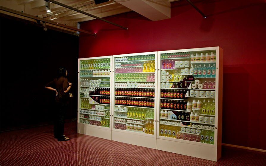
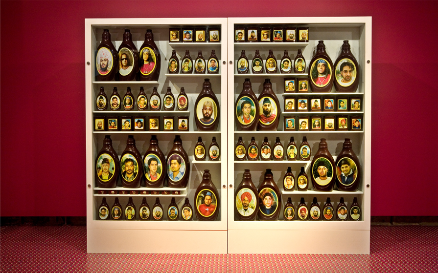
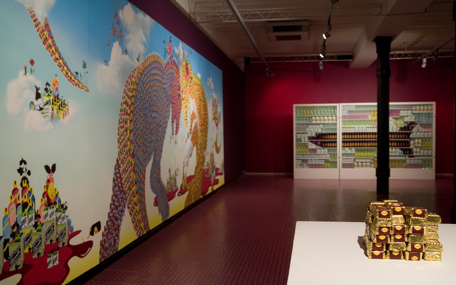
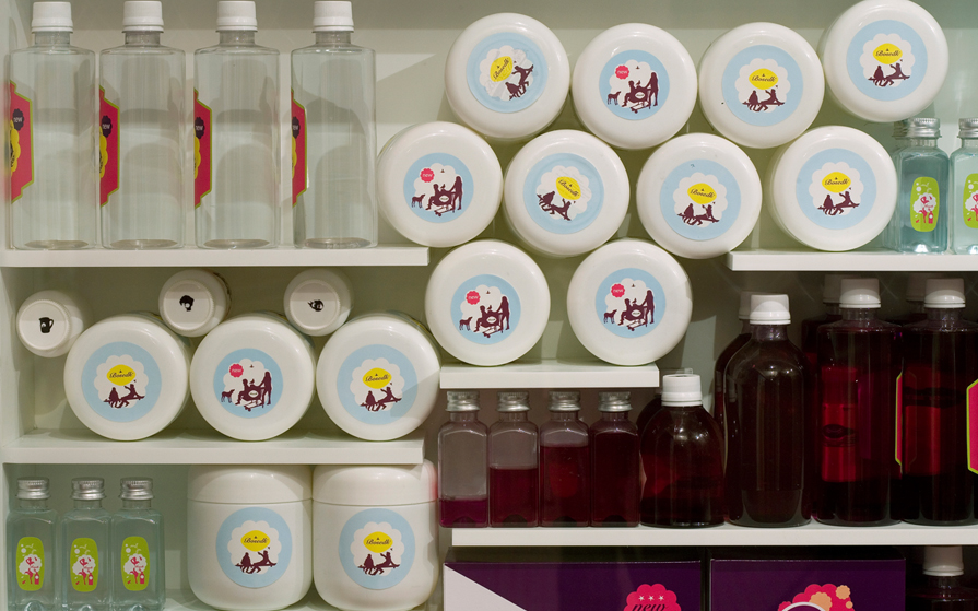
It’s all in the packaging, say the marketing gurus. Delhi-based Jiten Thukral and Sumir Tagra, at least, are not likely to disagree. Their second solo show in Mumbai, “New Improved Bosedk,” consisted of a large painting and several installations. The collaborative duo (better known as T & T) transformed Chatterjee & Lal into what resembled a luxury department store. The floor was carpeted with hot pink vinyl, and gleaming glass cabinets were stacked with plastic bottles brimming with gorgeously colored liquids.
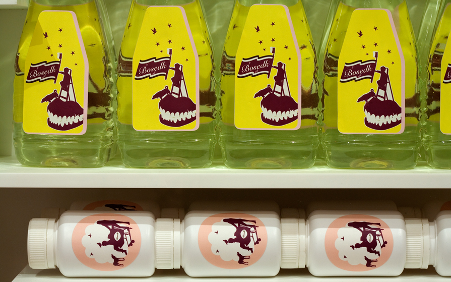
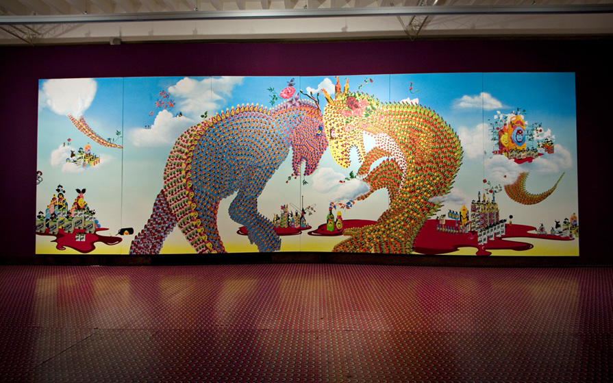
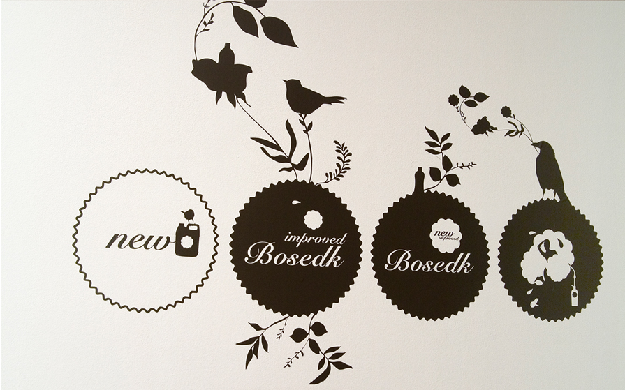
T & T started their careers as graphic and product designers. Their signature brand, Bosedk Designs–a hilarious name because bosedk is an especially obscene term of abuse in Punjabi, meaning “up the ass”–popped up all over this display: The flowery script of the logo was printed onto stickers, boxes, and bottles, offering critiques of the glamour ostensibly served up for the viewer’s delectation. The show was meant to give the “new India” brought into being by the economic reforms of the ’90s a rap on the knuckles for its avaricious consumption. In Keep Closed and Out of the Reach of Children (all works 2008), bottles of pastel-hued liquid are enticingly organized in glass cabinets–but the containers are arranged in the shape of a missile. The largest painting the duo have made so far, the triptych Coming Soon at Your Neighborhood, flaunts a “big is beautiful” aesthetic that mocks the massive malls overrunning Delhi’s suburbs. In the painting, two dinosaurs battle each other; their spiky scales are composed of tiny images of precariously balanced bottles embossed with T & T’s logo.
Thukral & Tagra were at their wicked best when they aimed their jibes at Delhi’s large Punjabi community, to which they belong. On a table stood a heap of liqueur chocolates, which visitors could devour for free. The pile of chocolates, each one stamped with a Bosedk logo and containing a gooey, whiskey-filled center, ridiculed the pretensions of nouveau-riche Punjabis–the logo spoofing their penchant for designer goods, while the alcoholic content surreptitiously refers to the way whiskey drinking is seen as a sign of machismo by Punjabi men. If providing whiskey chocolates at their own show catered to preconceived notions of the behavior of Punjabi men, the effeminate design of the gold foil wrappers undercut such stereotypes.
T & T’s marriage of art and design represents an international trend that is increasingly taking root in India. In March, for instance, Project 88 in Mumbai presented another such project, “The Experience of Transition,” an exhibition of architect Rajiv Saini’s one-off furniture-cum-sculpture pieces (inspired by Mumbai’s transforming urban landscape) in advance of an exhibition in Milan that will coincide with the Salone del Mobile. The recent profusion of Indian art ventures that seem bent on joining hands with design initiatives raises questions about T & T’s show: Are they critiquing conspicuous consumption in India or catering to it? Certainly, “New Improved Bosedk” took potshots at the consumerism that globalization has unleashed in Indian cities, but with its sexy colors and customized packaging, it also leveraged the lure of international design trends to enter one of India’s most lucrative commercial arenas: the art gallery. T & T’s design background gives them a special flair for negotiating this transition. But even so, the contradictory tendencies in T & T’s show are endemic to contemporary Indian art: Often called upon to defend the rights of those who are marginalized in the new India, it cannot help remaining indebted to the conditions it derides. -by Zehra Jumabhoy
Related Links: www.chatterjeeandlal.com